
Prepared by John Fiske for the Ipswich Historical Commission and the Architectural Preservation District Commission
PART I: COLONIAL AND FEDERAL 1640-1840

Paint was used to delineate the three main visual elements of Colonial and Federal houses:
- Body: the walls – usually clapboarded or shingled, sometimes boarded.
- Trim: the decorative woodwork that frames the large wall surfaces and often the smaller elements, such as windows and doors.
- Sash: The movable elements – doors, windows, shutters.
First-period houses rarely had painted trim and sash in different colors, and so were generally of two colors only; later styles often had three.
Colonial Period (1640-1780)
First Period or Post-Medieval (1640s–1720s)
- Architecture: asymmetry, verticality. 17th-century colors were derived from earth, stone or other natural pigments.
- Interiors: Earthy reds, indigos, ochre, burnt umber.
- Body: clapboards, originally not painted or stained but weathered to dark brown. Chocolate paint is appropriate today.
- Trim: Unpainted or painted Indian red/Spanish brown to contrast with unpainted body.
Second Period or Georgian (1725-1780)
- Architecture: symmetry, horizontality, classical proportions
- Georgian houses favored stronger colors from naturally-derived pigments. Colors imitating stone construction were popular exteriors, and interiors were bolder and brighter than once thought.
Modest and rural houses are often not painted. Strongly contrasted color schemes are favored. - Body: dark stone colors, chocolates, orange, ochers, greys, and reds.
- Trim: Almost always white, but a softer, yellower white than today’s white.
- Cornices, window and door casings, corner boards, and molded details often simulated stone – pale grey, yellowish-white, very pale blue, sometimes with sand blown into the wet paint.
- Doors: always dark color – chocolate, red, green, or blue.
- Roofs: occasionally red, chocolate, or yellow
Federal Period (1780-1830)
Fashionable taste moved away from the more robust Georgian toward lighter colors: white, off-white, pale shades of stony gray, and ochre. Bright, clear tones in interiors, often in contrast with pale trim – creams, pumpkins, sage green, muted blues, etc. The 1812 painting guide by Hezekiah Reynolds of CT advised a palette of “white, cream, straw, orange, pea-green, parrot green, grass green, red, slate, and black.” Lighter colors were fashionable, but darker ones were still used for more traditional tastes. Contrasts were less marked than on Georgian houses.
- Body: White, cream, and straw were fashionable, but orange, pea-green, red, and slate met more conservative, traditional tastes.
- Trim: White, or sometimes the same color as the body.
- The shutters and doors were dark green or black.
- House fronts were sometimes painted in fashionable, lighter (and more expensive) colors, while the back and/or the sides were in the more traditional, and cheaper, reds.
- Rural houses were often unpainted until the middle of the 19th century.
Greek Revival (1825-1860)
Colors remained traditional with no technological innovation in colors till the 1850s, so the earth-based pigments and natural stone colors of the Federal period are suitable for interiors and exteriors. Interior colors begin to reflect the richness and depth of color of the Victorian period.
- Body: White or off-white, or stone colors (greys, pale blue greys, grey browns, tans) or straw (ochres and yellows).
- Trim: White, off-white, cream
- Sash: Typically green doors and shutters, and a black sash.
- The most common (almost standard) color scheme: white or off-white body, green doors and shutters, and black sash.
- Rural houses were increasingly painted from 1825 onward.
PART II: VICTORIAN 1840-1900

Paint was used to delineate the three main visual elements of Victorian-period houses:
- Body: the walls – usually clapboarded or shingled, sometimes boarded.
- Trim: the decorative woodwork that frames the large wall surfaces and the smaller elements such as windows and doors.
- Sash: the movable elements – doors, windows, shutters.
- Body, trim, and sash were usually painted in different colors. A three-color paint scheme was the most common, but later in the period houses were often given four or even five colors.
Victorian architecture is characterized by the fact that different styles of houses were popular at the same time. In this respect, it differs significantly from Colonial architecture, where styles were sequential rather than simultaneous. In paint colors and paint schemes, the Victorian period saw a gradual transition toward a wider range of deeper colors and stronger contrasts. There were two distinct color periods: 1870 was the turning point.
Early Victorian (1840-1870)
Common architectural styles: The most popular was the Italianate, but Gothic Revival houses were quite common. Paint colors did not change much from the Federal period: Paints were still mixed by the painter from natural pigments ground into white lead and linseed oil, so many of the earth/stone colors continued to be used. The first “color card” published in the US (1842) included three shades of grey, and three of fawn (called “drab”). Darker, dignified colors were used on larger houses and those in exposed locations; lighter, livelier shades were for smaller, more concealed houses. The so-called “positive” colors (white, yellow, red, blue, and black) were avoided.
- Body: Traditional stone- and earth colors, soft and naturalistic to blend in with surroundings.
- Trim: Never white, often a darker shade of the body color, or vice-versa if the body was dark. Sometimes the body, trim, and sash were painted in three increasingly darker shades of the same color.
- Sash: Often the same as the trim.
Later Victorian (1870-1900)
Common architectural styles: Second Empire/Mansard, Stick, Queen Anne, Shingle. Paints now were mass-produced and mass-marketed in resealable cans. The wider range of colors included both new pastels (rose, peach, terracotta, and olive) as well as deeper and more saturated colors. Strong contrasts were favored. Three-color schemes for the exterior became the norm: one color for the body; a second for the trim; and the third, always the darkest, for the sash (doors, sashes, shutters.)
The primary pigments (red, blue, yellow) were often combined to create new “secondary” colors: orange, purple, green, etc. “Tertiary” colors were a mix of primary and secondary colors: dark mulberry, ginger, moss green, brick reds, buff, etc. The choice of colors was now guided by “color theory” instead of personal preference. The basis of color theory was the color wheel, which enabled two versions of “color harmony”: harmony by analogy and harmony by contrast.
- “Harmony by analogy” used adjacent colors on the wheel: e.g., red/orange, orange/purple, blue/green, yellow/green, green/orange
- “Harmony by contrast” used opposite colors on the wheel: e.g., red/green, blue/orange, yellow/purple.
Second Empire/Mansard (1855-1885)
The early houses in the style continued the Italianate taste for neutral colors: grays, tans, ochers, and warm beiges. Later in the period, more colors appeared, and stronger contrasts became popular: deep tones of russets, olives, gray-greens, ochers, and browns in combination. The aim was to achieve a more formal, urban look.
- Body and Trim: two shades of the same color, usually, but not always, with the lighter for the trim.
- Sash, doors, and shutters were black or very dark green; shutters sometimes a very dark shade of the body color.
Stick Style (1860-1890)
Characterized by an abundant use of flat trim boards to define, or create, sections of the clapboarded walls or to impose geometric patterns on them.
- Trim and Body: Flat trim boards clearly distinguished from clapboard sheathing, using vibrant, contrasting colors: yellow with dark green, dark red with olive, light and dark gray-green, etc.
- Sash, doors, and shutters: dark but colorful: dark brown, deep red, or maroon joined with the more traditional dark green or black.
The Stick style and its colors may be seen as transitional to the Queen Anne.
Queen Anne (1880-1915)
The architecture was characterized by variety, irregularity, and asymmetry. Complex massing of building elements, bays, towers, gables, porches, and windows of all sizes. Plentiful use of decorative motifs in molded mastic (plaster or sawdust set into resin). Walls were often clad in both clapboards and shingles, which were often cut into decorative shapes. Rich tertiary colors were popular, but light colors were not. Body, trim, and sash were always in different colors, but four- and occasionally five-color schemes were popular.
- Body: one or two strong colors (usually different for clapboards and shingles)
- Trim: a color unifying the body colors. Often, a different accent color was used for decorative features.
- Sash: the darkest color on the house: dark green, deep brown, black, deep red, maroon, chocolate, deep umber, etc.
Shingle (1880-1900)
“Wooden” and rustic in appearance, so colors must be “woody,” not light colors.
- Body: dark brown stain, or dark brown/chocolate paint. Dark olives, gray-browns, and dark greens are also possible.
- Trim: beige or tan to coordinate with body, or dark contrasting color – dark green, dark olive, maroon.
- Sash and doors: dark.
Resources
Painting Historic Exteriors: Colors, Application, and Regulation. (1998, reprinted 2016), Susan E. Maycock and Sarah J. Zimmerman, Cambridge Historical Commission, 831 Massachusetts Ave, Cambridge, MA 01928. 617.349.4683. A comprehensive guide to identifying each architectural style, with descriptions of the colors and color schemes appropriate to it. An essential resource for owners of historic houses.
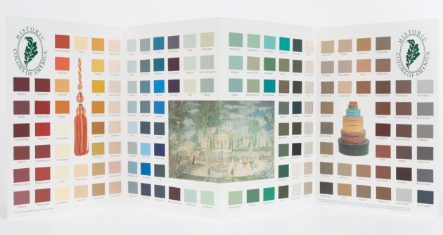
Historic Colors of America: A Guide to Color, Styles, and Architectural Periods by Historic New England. A brief overview of the main architectural periods/styles, with a list of the colors appropriate to each. Accompanied by a color chart of more than 100 historic colors, developed by HNE in conjunction with California Paints, which are available from California Paint dealers. HNE offers period paint color consultations to historic homeowners through its Historic Owner membership.
A Field Guide to American Houses, Virginia and Lee McAlester, (New York, Alfred Knopf, 1984.) A guide to all the main architectural styles/periods, illustrating the main features of each, together with typical detailing, geographic distribution, and regional variants. Highly recommended.

or left in a natural state of being unpainted.
I was hoping to get some information about 1830’s exterior paint colors for a church established in 1837.
Most Churches unless made of stone or brick were painted white with white trim in the US. White symbolically stood for purity. the roof would have been typically slate grey.
We are wanting to paint our circa 1897 Queen Anne home and are needing to find color palettes that are appropriate.
I am trying to figure out a color scheme for my parents old 1926 kind of faded orange stone home with 1 stone columns on the left side of porch, an iron rail column which is painted black in the middle, and another orange stone columns on the right side of the porch. The porch is concrete painted green with 4 concrete steps painted green on the right side. It is a fairly large porch which is almost as wide as the house. The roof, gable or top part of the porch is also the entrance to the attic is wood painted green and peeling very badly. Both my parents are deceased now with my mother recently passing at 90 years of age. I want to change the color of the 🏠 since its been that color every since they moved into the house in 1963. They would just have porch and windows anything wood repainted. The old big stones have always stayed orange as if that was the original color of the stones. I don’t know if it was or wasn’t. Please give me some suggestions for a color scheme for this home. I just inherited this house after mother passed in November 2020 and would like to do some changes to the exterior beginning with the colors but 1st I don’t know if the stones can be painted. Please let me know of a color scheme that may be used. Any suggestions are dearly appreciated.
We are planning to house painting north shore ancestral houses and I am glad I have read your blog This gave me more ideas on how to do the color choosing! Thanks a lot
This was helpful. I am currently preparing to paint the exterior of an 1850’s one room schoolhouse- and I want to keep it historically appropriate. If anyone has suggestions…
Marie hello,
Did you choose an ochre? That comes to mind before pantones and chemistry changed the game. I’m sure it came out great.
Thanks, Paul
Thanks for posting this, it was super helpful! I’m in the middle of a renovating a Queen Anne style Victorian built in 1905, and I needed to find out about the color scheme for these styles of homes.
Chris, so what colors did you decide upon? I am doing the same thing! Mine is a George F. Barber and she will be stunning once I am done!